One of my guilty pleasures is graphic design porn (that’s what I call it, at least): staring at well-crafted logos, symbols and brands beyond any reasonable amount of time. When graphic design porn meets hockey it can turn into an unhealthy obsession, like it did today when I discovered these:
These are minimalist logos of all 30 NHL teams. Another pornographer graphic designer recently tried the same exercise with household product labels. (Check out that link and if your imagination still isn’t captured, just move along. There are some headlines worth clicking through on the right.)
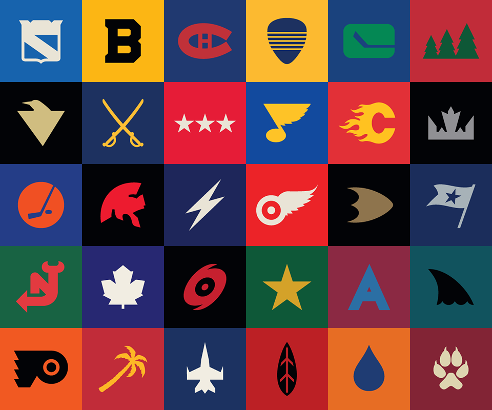
Here’s what I think I’m looking at in this collection of logos:
Top row: Rangers, Bruins, Canadiens, Predators, Canucks, Wild
Row 2: Penguins, Sabres, Capitals, Blues, Flames, Kings
Row 3: Islanders, Senators, Lightning, Red Wings, Ducks, Blue Jackets
Row 4: Devils, Maple Leafs, Hurricanes, Stars, Avalanche, Sharks
Bottom row: Flyers, Panthers, Jets, Blackhawks, Oilers, Coyotes
The genius of this exercise works on a couple levels. The use of color, shapes and lines alone would allow me to stare at this all day without caring what each logo represents.
But since I do know what the logos represent — and, um, how dare you mess with the Florida Panther! — this exercise reveals the strongest and weakest visual brands in the National Hockey League. Stripped to its core, can you still recognize your team’s logo? If so, your team did well on the drawing board. If not, maybe it’s time for a do-over.
For example, it took me a while but I realized that Segments adapted the Nashville Predators’ secondary logo rather than the more familiar fang-toothed cat. That’s not good. Looks like the Panthers (a palm tree), Coyotes (a paw print), Blue Jackets (flag) and Blackhawks (feather) presented the same problem of deciding what to minimalize.
That’s a fantastic font for the Colorado Avalanche to toy with, but how sad is it that an art-deco “A” is all that’s left when you strip away the swirling winds on the traditional logo? Somehow, the Bruins’ thick, block B doesn’t lose its toughness.
And yet, by far the worst of the worst minimalist logos — again, I don’t blame Segments as much as the material they had to work with — belong to the Kings and Senators. The Kings’ crown is befitting a prince who’s just been magically turned into a toad, not a Stanley Cup champion. The Senators’ Roman helmet resembles not a symbol of strength but the Japanese symbol for “harmony.” Way to control a room, Paul MacLean.
The best logos require no interpretation because they were fairly minimalist to begin with. In no particular order: Montreal, St. Louis, Detroit, New Jersey, Calgary, Toronto, Carolina, Philadelphia and Dallas.
The other teams ought to consider what they see here. Anaheim ought to adapt the webbed “D” as the crest on all its jerseys. While I love the fact that the Sharks have never messed with their basic logo, there’s something to be said for that fin. The same goes for you, Edmonton Oil Drop. It’s nice to see Winnipeg’s Jet not going down in flames, and it’s nice to see how powerful three white stars on a red background are in conveying the words “Rod Langway.”
What do you think?